Over the course of a year and a half, I broke a successful journey down into 7 steps that a user needed to complete. Each month I dived the data and our users research for each step. Because this data had never been explored before, I was able to generate a lot of new ideas for ways to improve user success.
For example, users told us that they didn’t want to adopt a new system or remember a new password, and that they spent all day in their email inboxes. They also told us that they really truly wanted a way to communicate securely with people who needed their services, but they were heavily resource and time constrained. And our data showed that this was one of the highest drop-offs.
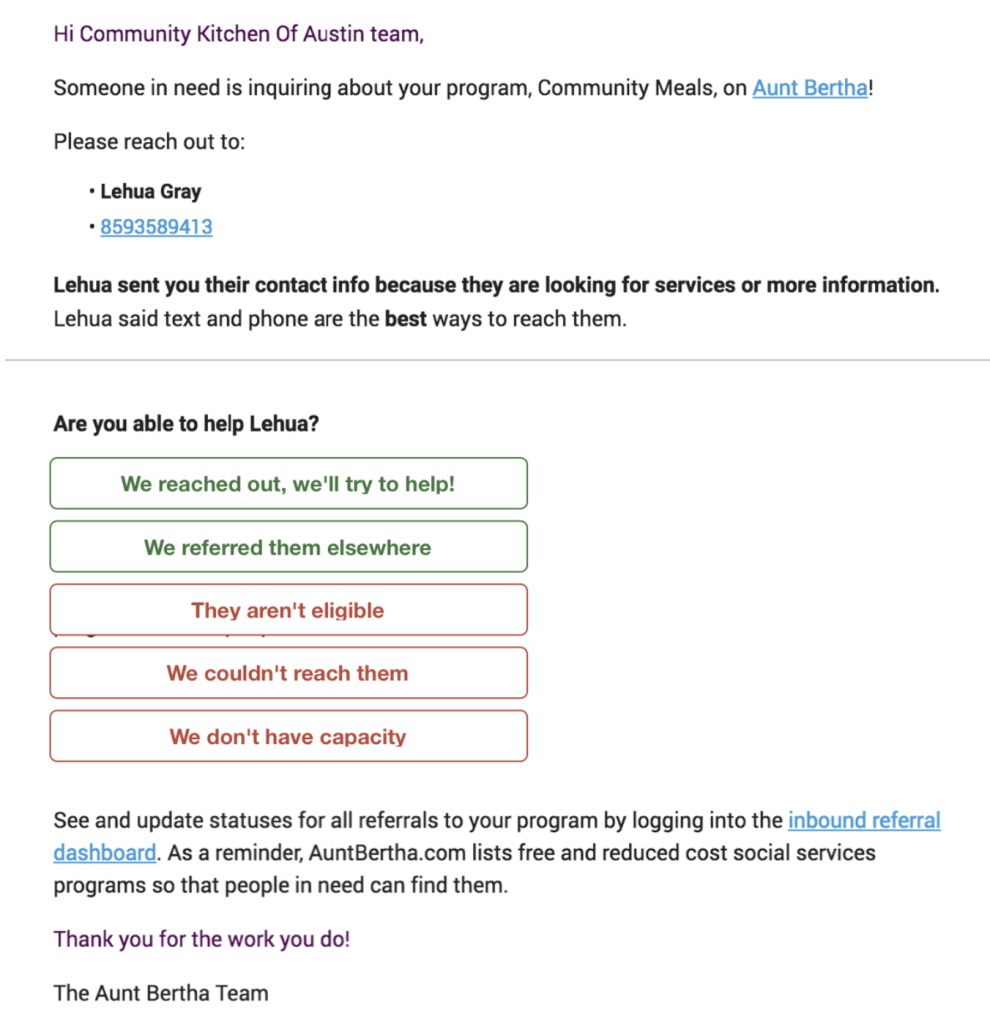
Based on that data, it was clear that we should give social service providers a way to communicate with clients without leaving their inbox. I worked with the Community Engagement team to try a low-fi proof of concept, before devoting our precious dev resources to a new idea. We sent a small, manual test run of 500 messages, and a tenth of social service providers responded.
Based on our test run, we built a new feature to respond with one click, in email. In just two months, more than half of our social service engagement is now through email, and we even have hundreds of in-app reply from providers who have never logged in to the system.

With a holistic look at the data, the solutions I came up with were also more holistic and more novel. Rather than responding to isolated client requests, we were able to strategically map out how each new feature affects the whole system, and how each feature can most effectively build on what we’ve built previously.