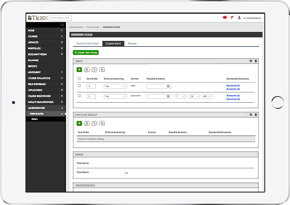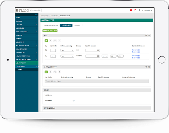
One of our teams goals with the complete UI redesign was to allow clients to customize their interfaces in a simple, foolproof, and gave beautiful results. This included allowing them to chose the two colors that would appear everywhere throughout the UI. But this presented a problem: for students and faculty with low-contrast vision, colorblindness, and several other seeing impairments, the brand colors of the client might not meet their visibility needs.

Typical user’s UI with branded colors. This school happens to use teal and blue, colors with high contrast already, but some schools chose yellow, green, or pink for their side menus!
It was unacceptable that some users would have difficulty using the interface, but equally unacceptable that client organizations wouldn’t have control over their own brand presentation. To offer an alternative, I created a special alternate stylesheet, using sass and high-contrast sprites. When activated by an individual user, this stylesheet replaced all colors on the system with high contrast colors. Designing this low-contrast style was the last piece missing for complete WCAG 2AA compliance.
By the time I built this high-contrast stylesheet, all of the elements had already been designed without considering contrast. Most of the pages in the system had already been completely re-coded with our new UI. I went through each and every page and element in the system, reverse engineering the visual UI with the aid of a low-contrast filter and a WCAG 2AA color contrast testing extension, until every single page and every one of our elements was completely visible and usable to users of all abilities.