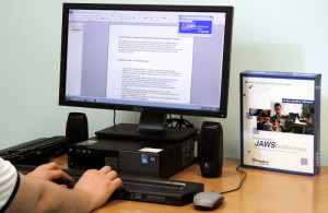
Just because it is possible to navigate with a keyboard doesn’t mean that it is easy or intuitive. I wanted to ensure we built a universally usable system, rather than just checking the WCAG 2AA boxes. I trained teams on how to use accessible patterns, tested our site with a blind user, and designed a high-contrast visual alternative.
