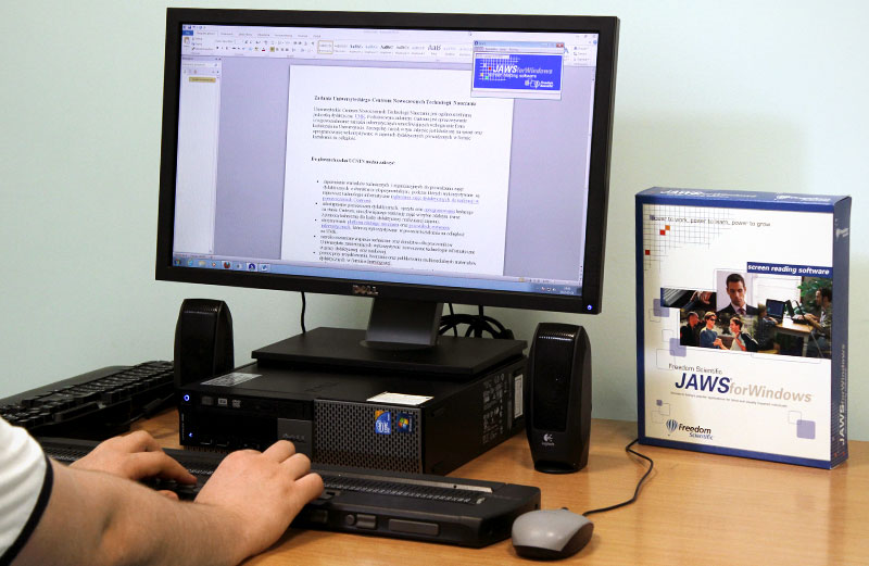
I trained myself and several members of my team to use a screen reader and test every page to ensure it is accessible, but just because it is possible to use a keyboard on a page doesn’t mean that it is easy or intuitive. I needed to test with a user who used a screen reader every time they got on the internet, to see if our descriptions made sense in a non visual way, our keyboard controls were intuitive, and our entire user flow made sense even without visual signposts.
I was able to find a blind college student (Tk20’s largest user demographic) who was a daily user of JAWS (the largest and most widely used screen reader in academia), and he was willing to test with us, but he lived and worked 8 hours away in Colorado. Because we only had one chance to test with him, and a huge system with hundreds of components, I proposed that we pick the most confusing, complicated, and interactive components and built them into a testing user flow. I collaborated with the User Researcher to design a testing script and a four-page testing product that would closely reflect a more comprehensive version of user flows throughout our site, and then I built the pages in HTML and hosted them at a temporary URL.
Running this test was very different from typical remote user testing, but nonetheless it yielded valuable insights. For one thing, user interactions can’t be analyzed visually, because the mouse never moved. As the user changed focus, we had to listen along to the screen reader to follow their progress. And boy does that screen reader read fast! We had to ask our tester to slow down JAWS’s reading rate; to our untrained ears, JAWS’s full speed reading sounded like meaningless static.